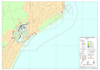
Our first blog assignment for Meteorology Class is to find examples of 5 different types of maps; Choropleth map, dot density map, proportional symbol map, isopleth map, and environmental sensitivity map. Below are the examples I found.
This is a
Choropleth Map of the Percentage of People over the age of 65 in the United States. This map was made from the data collected in the 1990 Census. From this map we can see that 9 out of the 50 states have a have a percentage of 16 and higher.
Here we have an example of a
Dot Density Map. This map shows the Asian population in the United States based on the 2010 Census. Based on the map, we can see that there is a high Asian population in the state of California and around the New England States.
Next is an example of a P
roportional symbol map. This maps shows the number of births that occurred in the year 2006. Based on the map, California & Texas had the highest number of births during 2006.
Our next example is an
Isopleth Map. This map shows the mean annual precipitation in the state of Georgia. As seen on the map, the highest precipitation occurred in the Northern counties. This map was made at the University of Florida in 2010.
The last example is that of an
Environmental Sensitivity Map for the coastal area of Kenya. It shows major environmental landmarks in the area.
Check out this link to see how New Orleans is preparing for Hurricane Isaac!


